
Page 1 of 2
| Saltley Signalling Diagram 21/01/2012 at 19:02 #27906 | |
|
headshot119
4869 posts |
I have just finished making a signalling diagram for Saltley with all the signal numbers shown. Feedback is welcome for my first attempt. It can be viewed here on the wiki. in a Gif format. Or here in PDF format. "Passengers for New Lane, should be seated in the rear coach of the train " - Opinions are my own and not those of my employer Log in to reply The following users said thank you: BarryM, ledgero2, AndyG, postal, officer dibble, Steamer, Meld, alan_s, Bobby, Prof Jolly, Stephen Fulcher, Backup, Laryk, ExDistrictDriver, TimB2010 |
| Re: Saltley Signalling Diagram 21/01/2012 at 19:10 #27907 | |
|
postal
5190 posts |
Both look the business, Karl. Great stuff and well done.
“In life, there is always someone out there, who won’t like you, for whatever reason, don’t let the insecurities in their lives affect yours.” – Rashida Rowe Log in to reply The following user said thank you: headshot119 |
| Re: Saltley Signalling Diagram 21/01/2012 at 19:12 #27908 | |
|
ledgero2
93 posts |
fantastic, thanks!
Log in to reply |
| Re: Saltley Signalling Diagram 21/01/2012 at 19:29 #27910 | |
|
37223
36 posts |
Looking good, bit too much pink tho :-p
Log in to reply |
| Re: Saltley Signalling Diagram 21/01/2012 at 19:51 #27912 | |
|
Steamer
3923 posts |
Excellent, well done!
"Don't stress/ relax/ let life roll off your backs./ Except for death and paying taxes/ everything in life.../ is only for now." (Avenue Q) Log in to reply |
| Re: Saltley Signalling Diagram 22/01/2012 at 11:29 #27937 | |
|
maxand
1637 posts |
Thanks for going to the trouble. But why do all these signalling diagrams have a white background? It doesn't help legibility and adds to eyestrain IMO. Is there some convention in SimSig regarding this? I must say I find the colour scheme confusing. Gives a new meaning to "Replace signal" - with cyan! Last edited: 22/01/2012 at 11:35 by maxand Log in to reply |
| Re: Saltley Signalling Diagram 22/01/2012 at 11:34 #27938 | |
|
Firefly
521 posts |
o Max, why do you say these things. I can just the karma nose diving :-) Let's just be grateful it's done and not worry too much about the colour. Log in to reply |
| Re: Saltley Signalling Diagram 22/01/2012 at 11:36 #27939 | |
|
maxand
1637 posts |
I just thought there was a reason all these signal maps are coloured this way.
Log in to reply |
| Re: Saltley Signalling Diagram 22/01/2012 at 11:37 #27941 | |
|
Steamer
3923 posts |
" said:I just thought there was a reason all these signal maps are coloured this way. The reason is that most people find reading black on a white background is easier than reading white on a black background. "Don't stress/ relax/ let life roll off your backs./ Except for death and paying taxes/ everything in life.../ is only for now." (Avenue Q) Log in to reply |
| Re: Saltley Signalling Diagram 22/01/2012 at 11:40 #27942 | |
|
headshot119
4869 posts |
" said:Thanks for going to the trouble. But why do all these signalling diagrams have a white background? It doesn't help legibility IMO. Is there some convention in SimSig regarding this?I have just followed the already set convention of the other ones on the Wiki. They where originally done with the white background to prevent using up excessive amounts of black ink if you wanted to print them (printer ink being the most expensive liquid in the world per ml, even more costly than bull sperm.) However just for you Max. It's now available here in what you would call "classic" SimSig colours. I tell you this colour invert button is magical. "Passengers for New Lane, should be seated in the rear coach of the train " - Opinions are my own and not those of my employer Log in to reply The following user said thank you: maxand |
| Re: Saltley Signalling Diagram 22/01/2012 at 11:42 #27945 | |
|
Laryk
56 posts |
Max - I think it's just a negative image. Colours weren't picked for any particular reason. Having said that you could probably edit the image to replace all cyan, for example, with a colour of your choice. A white background is also handy if you want to print it - I don't want to imagine the ink costs otherwise :D [sup]Edit: I think Karl beat me to it :)[/sup] Last edited: 22/01/2012 at 11:45 by Laryk Log in to reply |
| Re: Saltley Signalling Diagram 22/01/2012 at 11:47 #27947 | |
|
headshot119
4869 posts |
I'll possibly crack on with one for Derby once I get home from work. Also as a general question, would people like to see the "ground frame" signals on the main plans? For instance Warwick GF has two hidden signals which I did not include on my Saltley plan. Thoughts? "Passengers for New Lane, should be seated in the rear coach of the train " - Opinions are my own and not those of my employer Last edited: 22/01/2012 at 11:48 by headshot119 Log in to reply |
| Re: Saltley Signalling Diagram 22/01/2012 at 12:36 #27950 | |
|
Laryk
56 posts |
Firstly - thank you Karl for taking the time to make this. Secondly - here is my version of the diagram. I've replaced some of the harsh colours with ones that I think are a little softer. Karl - I hope you don't mind my interfering  Thirdly - I think having the text already on this sim saying "xxxx GF" is enough, seeing as the signals stay out of sight for most of the time. [sub]Edit: Seems the image quality has been adversely affected. Apologies.[/sub] Last edited: 22/01/2012 at 17:36 by Laryk Log in to reply |
| Re: Saltley Signalling Diagram 22/01/2012 at 12:39 #27951 | |
|
mfcooper
707 posts |
" said:They where originally done with the white background to prevent using up excessive amounts of black ink if you wanted to print themAfter the first SimSig signal diagrams were created, the user base really wanted a printer friendly version as many people don't have a spare screen or 3 to keep the diagram open whilst playing. These false-colour diagrams proved to be a very popular solution, and have been the standard way of producing the diagrams since. Log in to reply |
| Re: Saltley Signalling Diagram 22/01/2012 at 12:41 #27952 | |
|
maxand
1637 posts |
Thanks headshot, very kind of you. Actually, it didn't occur to me that people might actually want to print these diagrams, in which case a white background would certainly save ink. Whether white on black is easier to read than black on white is a moot point, though many say that since screens work by transmitted light whereas paper works by reflected light, black on white works better for paper and white on black works better for screens. I guess this is why IECC chose a black background for their panels, not white. Actually, black text on a grey background and grey text on a black background cause less eyestrain than pure white. Again, the choice of grey for unsignalled track and automatic signals is a good decision, though the same colour for titles seems a bit drab to me. What app do you use to produce this inverted video, and how do you switch it? I was thinking of converting some of my signal diagrams back to the original colours for viewing onscreen. Log in to reply |
| Re: Saltley Signalling Diagram 22/01/2012 at 13:37 #27953 | |
|
Steamer
3923 posts |
" said:What app do you use to produce this inverted video, and how do you switch it? I use Paint. Copy the image in, right click>Invert Colours. "Don't stress/ relax/ let life roll off your backs./ Except for death and paying taxes/ everything in life.../ is only for now." (Avenue Q) Log in to reply |
| Re: Saltley Signalling Diagram 22/01/2012 at 13:43 #27954 | |
|
postal
5190 posts |
Maxand I posted the first couple of diagrams I created in their original colours and the consensus on the old Forum was that they should not be text on black because of the cost in printer ink. It was so long ago that I can't remember which graphics app I used (it may even have been Paint which was surprisingly handy when dealing with a "viewed" rather than a "scrolly" sim), but every graphics package I have ever used has had the option to invert the colours; some packages have an option to create a negative of the original rather than an invert, but the effect is the same. I didn't see it as an effective use of my time to go round the sim changing the signal head colours one by one which is why the heads now show bizarre aspect colours. The pdfs I created are normally pictures inserted into an Open Office Draw document which then had the signal numbers added by inserting text boxes and finally exported as pdfs (but I still have most of the base Open Office .odt files saved on my hard disk). Provided you can unpick the pdf and extract the graphics file you should be able to invert the colours back to true representation without too much bother. Edit: Steamer posted while I was busy typing waffle! “In life, there is always someone out there, who won’t like you, for whatever reason, don’t let the insecurities in their lives affect yours.” – Rashida Rowe Last edited: 22/01/2012 at 13:45 by postal Log in to reply |
| Re: Saltley Signalling Diagram 22/01/2012 at 17:22 #27967 | |
|
headshot119
4869 posts |
" said:MaxandExport it as a flat gif file from OpenOffice Draw. Whack it in the Gimp and invert the colors. "Passengers for New Lane, should be seated in the rear coach of the train " - Opinions are my own and not those of my employer Log in to reply The following user said thank you: maxand |
| Re: Saltley Signalling Diagram 22/01/2012 at 17:36 #27969 | |
|
Peter Bennet
5362 posts |
" said:Thanks for going to the trouble. But why do all these signalling diagrams have a white background? It doesn't help legibility and adds to eyestrain IMO. Is there some convention in SimSig regarding this? http://www.SimSig.co.uk/index.php?option=com_kunena&func=view&catid=14&id=27857&Itemid=145#27861 ? Peter I identify as half man half biscuit - crumbs! Log in to reply The following users said thank you: Sam Tugwell, Meld, headshot119 |
| Re: Saltley Signalling Diagram 22/01/2012 at 17:58 #27972 | |
|
Stephen Fulcher
2026 posts |
The other reason was when Postal did the original ones, the sims were smaller and people often printed them.
Log in to reply |
| Re: Saltley Signalling Diagram 22/01/2012 at 18:31 #27977 | |
|
Firefly
521 posts |
Of course, you could just use the good old favourite answer of:- "that's the way it's done on the real world" See below! Last edited: 22/01/2012 at 18:33 by Firefly Log in to reply |
| Re: Saltley Signalling Diagram 22/01/2012 at 19:33 #27982 | |
|
GeoffM
6287 posts |
" said:[sub]Edit: Seems the image quality has been adversely affected. Apologies.[/sub]You've saved it as a jpeg which is a lossy format, better suited to photos. if you save it as GIF or PNG it compresses down nicely without losing any quality. Regarding the black on white thing, SimSig only uses a small palette size - 16 colours I think. A half decent program ought to be able to reduce the colour palette down to 16 without affecting anything there, and from then it should be a simple step to change the palette black into white and vice versa. SimSig Boss Log in to reply The following user said thank you: Laryk |
| Re: Saltley Signalling Diagram 22/01/2012 at 19:39 #27984 | |
|
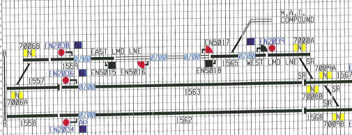
GeoffM
6287 posts |
" said:Somebody is bound to ask the question - it's a CAD drawing. The blue (shown purple) blocks are TPWS indicators that are normally hidden but show in the case of a failure. SR - Self Restore. SimSig Boss Log in to reply |
| Re: Saltley Signalling Diagram 23/01/2012 at 00:13 #28021 | |
|
maxand
1637 posts |
Thanks LaryK for providing an alternative map. I appreciate your thoughtfulness in changing signal colours in the inverted version back to red - a big step in the right direction, IMO. However, I personally prefer the pure primary red as there is no "mental translation" involved. Likewise your choice of olive green for the platforms. We all know they're platforms, but what if there was an unfamiliar object with the same colour? We'd have to compare it with another object of the same colour that we know. For this reason I prefer to duplicate original colours even if they seem a bit harsh, as long as they're legible. The main purpose of this map is to help find signal numbers. They should have the greatest contrast with the background; the other components should recede, therefore lighter colours are actually an advantage here. I agree with GeoffM that JPG images are unsuitable for this type of diagram. Not only are they lossy, as he pointed out, sharp edges tend to "bleed" colour. As Geoff mentions, they are best used for photographs such as portraits and landscapes on web pages. Even though SimSig's colours are primaries (red, blue, green) and major secondaries (cyan, magenta, yellow, etc.), so could be accommodated within the narrow but economic colour range of GIF images, I prefer PNG format, which is also very economical, very well supported and affords the opportunity to add comments, arrows, etc., in non-basic colours to good effect. Last edited: 23/01/2012 at 00:21 by maxand Log in to reply |