![]() Page is locked
Page is locked
Table of Contents
Introduction1. Usage of Screens
2. Spacing
3. Track
4. Signals
5. Platforms
6. Complex Shapes
7. Continuation Lines
8. Locations
9. Abbreviations
10. Miscellaneous
10.1. Track circuit overrides
10.2. On Duty, Workstation boundaries
10.3. Route direction locking arrows
10.4. Level crossing buttons
10.5. Pointwork not simulated
10.6. ARS subareas
10.7. Signalboxes
10.8. Ground Frames
10.9. Signal Group Replacement Controls
10.10. Colours
10.11 Tunnels
10.12 Bridges
10.13 Stop Boards & Fixed Distant Boards
10.14 SPAD Indicators
10.15 Overlap Markers
11. General
12. Entry Points
13. Additional Label and Control Buttons
14. Enhanced Simulation Labels
15. Electrification Markers
Appendix A Samples
Introduction
This document attempts to explain how screens are laid out in SimSig, the conventions of which are derived from Network Rail screen design guidelines. Sticking to these guidelines will ensure a realistic and consistent screen display. For reference, main points are numbered. Edits of this document should keep existing numbers as-is, even if new numbers are out of sequence. This is to prevent cross-referencing elsewhere going astray. However, style changes should be discussed in the Forum or elsewhere first. This style guide does not include controls.
Note that this covers UK sims specifically but may also be relevant to foreign sims.
1. Usage of Screens
[Paged] Up to 6 screens are available for released simulations. Two additional screens may also be used for debugging purposes but these are not properly supported at runtime. Each screen is 128 characters wide by 48 characters high, though the bottom two rows are used for controls. Additionally, the bottom four rows of the right hand half of each screen is also unavailable, due to the message area.
[Scrolly] There is no unreasonable limit on screen size. However, not everybody has large screens, or enough computer memory to store the screen data. As a rough guideline, try to keep to under 1500 cells wide by 54 high. Most people prefer a slightly wider display than one which requires panning both up/down as well as left/right.
1.1 Ideally, track layouts should read like a book: from left to right and from top to bottom. Obviously railways don't always naturally fall into this layout and have to be manipulated in the best way that is possible.
1.2 Generally, the track should be oriented the same way around as the signalbox that is being simulated.
2. Spacing
2.1 Each running line should be separated from another running line by one blank row. Where three or more tracks run parallel, an extra space may be inserted where the 10' falls on the real railway (if there is one). For four track railways it is either between tracks 2 and 3, or between tracks 1 and 2 with another gap between tracks 3 and 4.
2.2 Where two branches are geographically not adjacent, at least three blank rows should be between the running lines, though ideally four or more.
2.3 Two points that do not form a crossing should be separated by at least one character.
2.4 Any control element should have one character of space, both horizontally and vertically, between it and any other control element. Signals, for example, should not exist right above one another. Control elements are anything that can be clicked upon, such as signals, points, and slot controls:
3. Track
3.1 Each section of straight track should be at least two characters in length. Tracks with a TD berth embedded in them should have two characters either side of the TD berth (ie at least 8 characters wide in total):
3.2 Each point should have one character on each leg between it and any adjacent point or track circuit. Traps should also have one or more characters otherwise the point is "lost" when a route is set through it.
3.3 Parallel tracks on curves should be separated by at least one horizontal blank square. For the 10' spacing, at least two blank characters should separate tracks.
3.4a A track circuit joint/break should not occur at the same place as a change of direction, i.e. from horizontal to diagonal. Instead, use a straight piece of track before the joint.
3.4 A track circuit joint/break should not occur at a wrapping/continuation line.
3.5 Fixed diamond crossings should show in one of the two following forms, but the choice must be consistent across the simulation:
3.5a Characters d/e or f/g when not locked; h/i or j/k when locked diagonally; aa when locked horizontally (older Network Rail standard)
3.5b Characters d/e or f/g in any state (newer Network Rail standard)
3.6 Sand drags should be denoted by a single space character, background orange (i.e. similar to platforms) immediately off the end of the track.
3.7 Ends of tracks (buffer stops), i.e. bay platforms and single sidings, take one of two forms depending on whether it is a dead-end from which trains do not fall off.
3.7a Use Alt+0255 (escape sequence) around square brackets [ or ] as appropriate for the direction for a dead end / single siding where trains remain in-sim
3.7b No square brackets for siding(s) where trains fall off
3.7c There are cases which don't fit in to either (a) or (b), such as a conditional exit. Use judgement appropriately.
4. Signals
4.1 The base of a signal should "point" to the first or last character of the TD berth: first character for left-facing signals, and last character for right-facing signals. It may also be one character beyond if a platform is in the way. For consistency it is also possible to always use the character beyond the TD berth - but don't mix styles without good reason.
4.2 The auto or emergency button should be placed at the base end of the signal. If this is not possible, then it can either go to the right of the aspect (flipping the orientation of the A or E/R button), or directly below on the opposite side of the track (ensuring it can't be confused with another signal's button). Immediately above or below (ie Y +/- 1) should be avoided.
4.3 If the signal has a yellow warner triangle, this should go at the base of the signal, allowing a one character gap between it and the signal. This will force any auto button back further, such that the warner triangle is between the auto button and the signal post. The triangle should always point towards the signal; not with its back to it:
4.4 TRTS indicators should go adjacent to the signal head, or, if there is a platform, on the platform face that is appropriate to the signal.
4.5 Repeater signals should have a label "R" or "RR" (as appropriate) adjacent to the signal post or to the top aspect. Whichever convention is used, the same convention should be used throughout the layout where possible. Exceptions can be made where a repeater with a double yellow aspect can also show single yellow where there would be an undesirable gap between the R/RR and the signal. R/RR labels should be used even if the signal itself is not identified with an R/RR suffix (as most new signals tend to be these days).
4.6 Parallel signals on parallel lines should be shown as such. In this context, parallel can be considered to be within a couple of hundred yards or so.
4.7 Back-to-back signals, such as Up and Down for the same line on a gantry, should be shown with the aspects facing each other, rather than the posts back-to-back. This takes up a little more room but is more natural to look at and use.
4.8 Shunt signals should follow the same rules as above with regards to positioning, but can also be spaced one character close to the track joint if preferred. Again, one style or the other should be chosen, not a mix of both without good reason.
4.9 Not all signals have their own TD berth. Sometimes a track with a signal at both ends is more than eight characters long, meaning the TD berth is either centred or biased towards one end. In such cases, the signal should be placed relative to the theoretical position of the TD berth. See the Samples below.
4.10 Entrance cursors should sit on the first PEL of the first track beyond the signal. This may need the entrance cursor character (SIG-ETC) altering if, for example, the first character is an overlap marker.
5. Platforms
5.1 These should be drawn four characters wide by one character high. Shorter platforms may be used if space is tight; similarly, longer platforms may be used to fill space. The background should be orange with any text in black. Even if no text is used, set the foreground colour to black. This combination ensures the correct colour is shown on the overview screen, which would otherwise show platforms in grey.
5.2 Arrows (for track direction) on a platform should be in black when not illuminated and white when illuminated.
6. Complex Shapes
Some examples of how to draw some more complex shapes:
| Double slip |  |
| Scissors crossing (most common method) |  |
| Scissors crossing (the ideal shape but consumes a lot of space) |  |
| Scissors crossing (least preferred but necessary in tight spaces) |  |
7. Continuation Lines
7.1 Several conventions exist on Network Rail. The one preferred is the lettered approach, with a view number when the continuation is on a different view. Some IECCs just have a "VW2" label or suchlike and the same letters used on different screens, but this can be ambiguous, particularly when more than one continuation carries over the same screen boundary.
7.2 Track joins should never occur on a boundary. Instead, at least one character of the same track should appear on both sides of the continuation line.
7.3 Where a signal and its block joint occurs near a boundary, it is preferred to have the whole overlap track before the boundary, rather than splitting the overlap track over the boundary. This makes it easier to see that a route is set, athough the signal post is also a visual cue.
8. Locations
8.1 Timetables can be easier to write if the official Network Rail TIPLOCs are used. Not all sidings have TIPLOCs but occasionally odd signals have their own TIPLOCs. Sometimes the same siding can have multiple TIPLOCs, particularly with the proliferation of FOCs these days who each want their own name for the same shared use siding.
9. Abbreviations
9.1 There are a few conventions in place but these are the ones preferred:
- Dn - Down
- Rd - Road
- Jn - Junction
- Rec - Reception
- Ln - Line
- Gds - Goods
- Rlf - Relief
- Mn - Main
- UM - Up Main
- DM - Down Main
- Sdg - Siding
- LOS - Limit of shunt
- Bch - Branch
10. Miscellaneous
10.1. Track circuit overrides
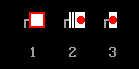
10.1.1 These should consist of a hollow red circle (letter p) when not operated and a solid red roundel when operated.
10.2. On Duty, Workstation boundaries
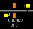
10.2.1 Dark green should be used for workstation boundaries and labels. This includes the edge of control area if desired, though it is not necessary to show this.
10.3. Route direction locking arrows
10.3.1 These should consist of a grey arrowhead with single or double character tail made out of the character #137 thin line. Where a bi-directional line has a predominant direction, this arrowhead should be doubled but with a single character tail, while the opposing arrow should be single headed but double tailed. When locked the whole arrow should appear in white. When the direction is locked out by a Patrolman's instrument, the arrow should appear in red. PLODs usually apply to the "wrong" direction only; no right-direction lockout is usually possible except in station platforms).
10.3.2 Where there is no locking, i.e. single direction lines, a grey arrow arrowhead with a tail should be used. If both running lines are uni-directional then it is permissible to have a single label between the two tracks, i.e. <- UP MAIN DN ->. Otherwise each line should have its own label, i.e. <- UP MAIN ...and... DOWN MAIN -> (on separate lines).
10.4. Level crossing buttons
10.4.1 MCB & CCTV crossing control should be laid out as follows:
Where a simulation has no crossings fitted with auto lower, preference is to use figures 1,2,4 for crossing controls, though figures 1,3,5 are accepted for legacy situations.
Where a simulation has one or more crossings fitted with auto lower, figures 1,3,5,6 must be used.
10.4.2 An optional “LCK” roundel may be provided, this will be hollow white when the crossing is free to raise, and solid red when the crossing is locked down.
The indication should be driven via a flag which tests the appropriate identical conditions for the crossing to be held down (CLX:DWN + Appropriate signals or routes clear across the crossing), optionally it may also test that the crossing is in a clear state (crossingClear,GMOBBERLEY)
10.4.3 Where a disable level crossing startup option is provided, controlled crossings which are disabled shall be shown drawn in grey, with the associated controls, and control labels removed.
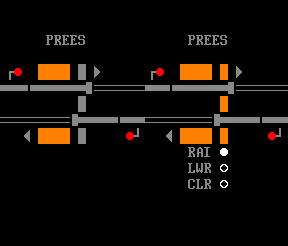
Prees MCB crossing left disabled and controls removed, and right in use with controls shown.
10.5. Pointwork not simulated
10.5.1 Where, for example, there exists a crossover between tracks that is clipped and padlocked out of use, this can be shown with the t/u/v/w/x characters to acknowledge its existence.
10.6. ARS subareas
10.6.1 The labels for these should be limited to 8 characters in length although the editor and compiler do not mind if you use more. Spaces should not be used. The displayed text must match the ID (without the A prefix) otherwise messages and screen labels will not tally, nor would Interface Gateway messages and screen labels.
10.7. Signalboxes
10.7.1a If shown, these should be shown in grey.
10.7.1b Panel boxes should be shown with winged corners. Lever frames should be shown with a straight horizontal bar.
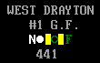
10.8. Ground Frames
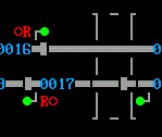
10.8.1 A white letter N should have an adjacent circle, hollow if not normal, solid if normal, white in both cases. A dark green letter F should have an adjacent controllable circle, hollow if normal, flashing solid if release given but not taken, and solid if released, dark green in all cases. The "release given but not taken" occurs twice: firstly when the signaller left-clicks on the F circle to release the ground frame and before the person at the ground frame uses the king lever; and again when the king lever is restored but the signaller hasn't yet cancelled the release by right-clicking on the F circle.
10.8.2 The label for the ground frame should appear directly above or below the N and F controls.
10.8.3 The release number should form part of the label or adjacent to the N or F letters.
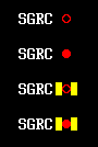
10.9. Signal Group Replacement Controls
10.9.1 The label should be in white. The control should be a hollow red circle when not operated (p) and a solid red circle when operated (q). There should be a pair of yellow blocks either side when a reminder device has been placed (characters [ and ], escaped with character <255> (otherwise they turn into 'a' characters when "show track breaks" is turned off).
10.10. Colours
10.10.1 For anything not listed above, note the general use of colours as follows:
- Red - bad, danger, failed, occupied
- Yellow - warning
- Green - good, working, clear
- White - important
10.11 Tunnels
10.11.1 Best seen with the sample in Appendix A. If you turn your head on your side, it looks like a tunnel mouth. Dashed lines should denote the length of the tunnel. For very long stretches of tunnel it is sufficient to show just a few dashes at either end.
10.11.2 Tunnels should be labelled, optionally with the length as well. If the length is shown then all tunnels should show this information on a simulation, and in the same units (metric or imperial).
10.12 Bridges
10.12.1 Best seen with the sample in Appendix A. The lower side looks like an 'n'; the upper side a 'u'. Bridges look best with at least two horizontal characters forming the "portal". The dictionary definition of bridge also includes viaducts for this purpose.
10.13 Stop Boards & Fixed Distant Boards
10.13.1 Stop boards can be drawn in 3 ways: Note (2) and (3) are only for legacy situations, (1) is for all new simulations.
- (1) As Drawn on WestCAD installations: A square of red background with a smaller white square formed of characters [ and ], escaped with character <255> (otherwise they turn into 'a' characters when "show track breaks" is turned off.
- (2) Solid Red Circle (q) on a white background with black, vertical, hollow track for the text on the sign
- (3) Cut-down version of 2 for use in restricted spaces
10.13.2 Fixed distant boards
Fixed distant boards should be drawn as foreground yellow [ and ], escaped with character <255> (otherwise they turn into 'a' characters when "show track breaks" is turned off.
Note legacy fixed distant board styles are not documented.
10.14 SPAD Indicators
10.14.1 SPAD indicators should be drawn like a signal but with a solid blue roundel when inactive and flashing red roundel when activated. The post should be grey.
10.15 Overlap Markers
10.15.1 Per GK/GN0525 ROL (Reduced OverLap) markers are not shown on overview screens. They may be shown in SimSig at the developers discretion, and if shown must be shown consistently.
11. General
Obviously these are only guidelines and guidelines will have to be broken in order to make a usable SimSig. Please do not get too hung up if exceptions are made in certain cases - though each case should be justifiable.
A particular example is when the developer wants to copy the IECC (or other control system) displays as accurately as possible. In that situation, this style guide goes out the window. But to aid the testers, they should be provided with screen shots of the real display system to prevent unnecessary Mantis issues from being reported.
12. Entry Points
12.1 Entry points will be named in the following format "Location (Qualifier)" where the Qualifier is optional. The Qualifier will be the line name, geographical reference, or signal number as displayed to the player at the location.
Examples:-
Wigton - Location with no qualifier
Wigton (Down M&C) - Location with line name as the qualifier
Maryport Up Siding (33) - Location with signal number as the qualifier
Workington CSD (WN2.12/13) - Location with signal number and appropriate prefix as the qualifier
Workington Down Yard (Down) - Location with geographical reference as the qualifier
12.2 Entry points and exit locations for a simulation will be the same at each fringe.
E.g A theoretical Whitehaven simulation would have the exit location as Workington Station on the Down line, with a matching Workington Station entry point on the Up line. In this case additional entry points may be supported for Workington Up Through Siding as this entry point would be closer to Whitehaven than Workington Station. An entry location of Workington Reception Siding would generally not be considered as this is at the same mileage as Workington Station.
12.2.1 Where a developer believes a justification exists for entry and exit locations to be separate, they should consult with an administrator early in the development process to agree a way forward.
13. Additional Label and Control Buttons
Where controls are provided on the screen for the user to turn on or off additional labels, boundaries, or control numbers these should have a three character code on a stone background, padded out with an extra space character on each end. The text should be black when the control is off, and white when the control is on.
| Control | Text |
|---|---|
| Electrification Limits | ELC |
| External Box Names | EXT |
| Length Labels | LEN |
| Additional Location Labels | LBL |
| Interlocking Labels | INT |
| Signal Numbers | SGN |
| Point Numbers | PTN |
| Track Circuit Numbers | TCN |
| Panel Notes | NOT |
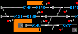
An example of controls for interlocking boundaries, and additional location labelling is given below.

14. Enhanced Simulation Labels
Where a simulation is relatively complex in terms of layout, or routing options, it may be necessary to provide more eye catching visual labels for the end user.
14.1 Key location labels may be shown in white instead of grey. Generally these locations should be major stations, yards, and junctions which are key to all trains.
14.2 Additional notes to help the end user with routing of trains may be provided which can be turned on or off by the end user. These should use a button as documented in section 13. The labels should use the background colour "FFFFCC" using the MIS:CCV key, with text in black. Use these sparingly see the Crewe simulation for practical examples. These should include a one PEL border top and bottom, and a two PEL border left and right of the note.
15. Electrification Markers
Where a simulation contains electrification, it may be necessary to provide a visual indication of the limits of the electrified area. Where one limit is shown, all limits should be shown.
15.1 This should be done using boundary lines coloured pink (fi), with a label showing the type of electrification and which side of the boundary is the electrified side. Curling the boundary line also helps emphasise which side the electrification applies to.
15.2 Acceptable labels for electrification include “AC”, “DC”, “3DC”, “4DC”.
15.3 Where part of a simulation is dual voltage it can be clearer to mark the signals which can be used by the less dominant electrification type using markers made up of “zzz” or “yyy”. A good example of this can be found on Wembley Mainline with the 3DC electrification marked as such around London Euston.
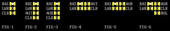
Appendix A Samples
 |
Shows a trap point with "h" character on the trapping end (3.2); TD berths with two characters either side (3.1); signals mounted one character to the side of the TD berth (4.1); platforms (5.1) Note that the platforms here are staggered in real life, hence the alignment shown |
|
 |
Shows the graphic for a tunnel (10.11.1) (label not visible); emergency/auto buttons located at the base of the signal (4.2) | |
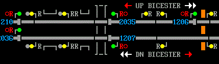 |
Shows two different placements of R and RR on repeater signals (4.5); tunnel (10.11.1) (label not visible); emergency/auto buttons located at the base of the signal (4.2); bridges/viaducts (10.12.1); direction arrows (10.3.1) Note that the repeaters with double yellow aspects have the R/RR labels on the base side of the signal, compared to the aspect side for single yellow/green repeaters. This example attempted to follow the IECC display and is thus an allowed exception |
|
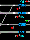 |
Shows the positioning of a ground shunt signal (4.8) where a TD berth is not immediately adjacent (4.9). Note that the uppermost shunt signal is geographically parallel to 589 so is shown as such, whereas the lower is not adjacent to 591, and is placed where the TD berth would be if it had its own TD berth. |
Last edited by headshot119 on 21/08/2023 at 19:26