
Page 1 of 3
| New Royston signals map using PNG images 22/01/2012 at 23:39 #28017 | |
|
maxand
1637 posts |
I've added links to new signals maps for Royston to its manual page Being a one-page sim, this didn't take too long. However, it was an opportunity to play with different font sizes and colours. Eventually I settled for Arial 9 Bold for all signal numbers and restored the original signal, platform, etc. colours in the inverted version (for printing purposes). This was done in Paint.NET.  Running (= main) signals are numbered in yellow, shunt signals are in white and automatic signals are in grey.  Last edited: 22/01/2012 at 23:56 by maxand Log in to reply |
| Re: New Royston signals map using PNG images 23/01/2012 at 00:18 #28022 | |
|
jc92
3629 posts |
couple of comments on this: a) there are two different coloured fonts in use to confuse the user, as far as i can tell this is based on gold for running signals and white for shunt signals, why bother? it just adds unnessecary extra info for the user to decode. edit: i have just noticed you mentioned this in your post but my point stands b) some of the numbers have been implemented over the track plan (LK246, K249, K244 K978) which isnt the best design ethic, its just making them more difficult to read, either repositioning, use of arrows or a smaller font may be useful however the effort and thought is of course, much appreciated "We don't stop camborne wednesdays" Last edited: 23/01/2012 at 00:19 by jc92 Log in to reply |
| Re: New Royston signals map using PNG images 23/01/2012 at 00:23 #28024 | |
|
GeoffM
6282 posts |
'Course, being really picky, signal labels in blue are those fitted with TPWS; those in grey without. But that's likely being too pedantic.
SimSig Boss Log in to reply |
| Re: New Royston signals map using PNG images 23/01/2012 at 00:24 #28025 | |
|
jc92
3629 posts |
unless TPWS equipment failures are implemented? 
"We don't stop camborne wednesdays" Log in to reply |
| Re: New Royston signals map using PNG images 23/01/2012 at 01:10 #28029 | |
|
maxand
1637 posts |
All right, guys, stop talking in jargon that isn't even in the Wiki. :) From Wikipedia: Quote: The Train Protection & Warning System (TPWS) is a train protection system deployed across the entire UK passenger railway network, as well as in Victoria, Australia.[1] It automatically activates brakes on any train that has passed a signal at danger or is overspeeding. It is fitted at selected sites, including some lines where automatic train protection (ATP) is installed. I gather Geoff has picked up on my choice of blue for running signals. Well, do any sims depend on TPWS failures or is this likely to be incorporated? Are we talking about maps or screens with a white background or a black one? Would any other professional signaller be put off by my using a blue font (inverted color of yellow) in inverted-video pics? This could be important. As far as the rest of it goes, choice of colour is, of course, personal. Different colours for main signals vs shunt signals help to distinguish them IMO, otherwise the only other way is their icon shape, since their aspects are both the same when at danger. I think it helps visualize an area. Signal maps can and should be used for more than finding signals. I would like to see those who write manuals add cross-references to the actual signal maps themselves, e.g., putting a white circle around those signals, or groups of signals, with special behaviours, rather than leaving it to us. For this reason I also included a plain screen capture, without signal numbers, for users to append their own comments. As for overwriting parts of the track plan with signal numbers (e.g., K977), I first tried positioning the numbers further away, which made it more difficult to associate the number with the signal. Then I tried linking number and signal with an arrow pointing to the signal, which looks messy. Finally I tried reducing the font to 8 (the minimum), which didn't save much space and just made the number harder to read. Finally I adopted the present method. Yellow and blue are easily legible over light & dark grey respectively IMO. For signal types used in SimSig I like Clive's post here. Last edited: 23/01/2012 at 01:11 by maxand Log in to reply |
| Re: New Royston signals map using PNG images 23/01/2012 at 01:29 #28030 | |
|
jc92
3629 posts |
image attached with a perfectly simple way of displaying signals so they dont conflict with track by the way. TPWS is hardly "jargon". its a widespread well known system of train control 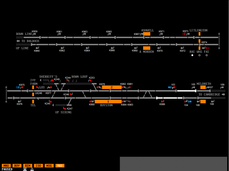
Post has attachments. Log in to view them. "We don't stop camborne wednesdays" Last edited: 23/01/2012 at 01:31 by jc92 Log in to reply The following user said thank you: Prof Jolly |
| Re: New Royston signals map using PNG images 23/01/2012 at 01:53 #28031 | |
|
AndyG
1834 posts |
Another way of showing signal nos is to interpose them into their associated berths, and just add text labels for the rest. Might even help with differentiating between main and shunt signals. I can only help one person a day. Today's not your day. Tomorrow doesn't look too good either. Log in to reply |
| Re: New Royston signals map using PNG images 23/01/2012 at 03:50 #28033 | |
|
maxand
1637 posts |
jc92 wrote: Quote: image attached with a perfectly simple way of displaying signals so they dont conflict with trackI agree, that looks neat and tidy. What font and size did you use, by the way? I chose to put signal numbers alongside signals where possible, you chose to put them above or below the signals. IMO either works well. The purpose of the map is primarily to display signal numbers and location, not so much track. The important thing is to try to be as consistent as possible with whatever scheme one chooses. There will always be compromises; for example, in your screen pic, K247 is alongside the signal, this being the best spot for it. As far as using berths to display signal numbers, this can be misleading:  A signal's berth must always be behind the signal, so unless one remembers this, one can easily mistake K984 and K983 for each other. Furthermore, although K249 has a berth, K244 does not, and although K253's Interpose option is enabled, attempting to interpose anything into it has no effect (probably a bug). Log in to reply |
| Re: New Royston signals map using PNG images 23/01/2012 at 04:28 #28034 | |
|
jc92
3629 posts |
" said:jc92 wrote:Arial size 8 in MS paint "We don't stop camborne wednesdays" Log in to reply The following user said thank you: maxand |
| Re: New Royston signals map using PNG images 23/01/2012 at 04:28 #28035 | |
|
maxand
1637 posts |
On the subject of using different colours for different types of signals, this may not be to everyone's taste, but it is possible to replace instances of a particular colour with another one, anywhere in a SimSig diagram. Here's how to do it. I use Paint.NET, a free program that works with Windows XP SP3, Vista and Windows 7, but no doubt similar features are available in other apps. Let's say you've just inverted your colours (Adjustments > Invert Colours) to create an economical printable document, but the red signals are now coloured cyan (aqua). Want to change them all back to red en masse? Simple. First, click on the Magic Wand icon in the Tools window and drag the Tolerance slider left from the default of 50% to no greater than 30%, say 25%, so the wand doesn't pick up the orange platforms and LCs, only the cyan signals. Next and optional, increase magnification to 200% so you can see edges more clearly. Holding the Shift key down, left click within one of the cyan signal dots. Shift+LClick will not just select it but all similar colours; in other words, you should now see a selection circle around each cyan signal. Next, select the Paint Bucket tool. In the Colors window, click the red square to make that the primary colour. Holding down the Shift key again, left-click on one of the selected (cyan) signals. It and all other selected signals will be converted back to red in one step. Finally, change back to the Magic Wand, select the same signal and press Shift+Alt+LClick to deselect all selected objects. (Alt+LClick deselects just that object; Shift+Alt+LClick deselects all.) Done. Repeat this on other objects such as platforms/level crossings, etc. If you find Magic Wand selecting too many differently coloured objects, reduce Tolerance still further. Press Ctrl+Z to reverse changes. The only other important consideration is antialiasing, i.e., reducing the jagged edges ("jaggies" on objects by blending in pixels with tones in between one solid colour and the adjacent one. Fortunately, SimSig does not use antialiasing in its panels, which makes it easy for you to change blocks of solid colour from one colour to another, as described above. Unfortunately, the signal numbers I used in my Royston map are antialiased, resulting in a nicer-looking font but making it extremely difficult to vary the colour. Here is an example: The left-hand number is antialiased; the right one is not. Here's how they look in actual size:  The un-antialiased number is not displeasing, so if you plan to distribute a similar map to anyone who might wish to change colours (colour blindness being one reason), make sure that you turn antialiasing off (In Paint.NET, select Antialiasing Disabled from the Text menu when the Text tool is selected). HTH. I have no plans to redo my Royston map with antialiasing turned off, so will leave that to you as an interesting exercise. :) PS in the pics above, remember I used Bold in both fonts. Haven't got time to go back and post similar pics with boldface turned off, but you should experiment with both options, particularly when antialiasing is turned off. Last edited: 23/01/2012 at 04:45 by maxand Log in to reply |
| Re: New Royston signals map using PNG images 23/01/2012 at 05:51 #28037 | |
|
maxand
1637 posts |
jc92 wrote: Quote: TPWS is hardly "jargon". its a widespread well known system of train controlIt mightn't be jargon to you, but it's really got very little to do with signalling in SimSig. Why should it? You might know all about it, but it would only come into play when a driver passes a signal at danger (SPAD) or overspeeds. Neither is ever permitted to happen in SimSig, so how could a novice be expected to know anything about it? It's not even in the Wiki. Luckily for me, I have a black belt in BVE, so am conversant with these matters.
Last edited: 23/01/2012 at 07:20 by maxand Log in to reply |
| Re: New Royston signals map using PNG images 23/01/2012 at 06:13 #28038 | |
|
northroad
870 posts |
Max, Can I ask that in order to avoid confusion between the various signalling diagrams having their own querks in design and appearance, are you going to revise each and every one to create one standard for all? I must admit I copy each of them and have them beside me for ease of reference when playing the various Sims. Geoff Log in to reply |
| Re: New Royston signals map using PNG images 23/01/2012 at 06:16 #28039 | |
|
maxand
1637 posts |
As a follow-up to my post #10, here is an even simpler way to change all objects of one colour to another colour using Paint.NET's Recolor tool. It might take slightly longer than using Magic Wand, but its simplicity makes up for this. Again, let's take the situation where on an inverted-colour map (white background), we wish to revert all cyan signals to red. Open your (hopefully, PNG) file in Paint.NET. First, in the Colors window, select Secondary from the drop-down list and click the cyan square in the palette to make cyan the Secondary colour. Next, select Primary and click the red square to make it the Primary colour. Note that Recolor changes the colour from Secondary to Primary, not the other way round. Turn the Tolerance down to below 30% (0% or 10% work best) to avoid recolouring objects of similar colour. 0% ensures an exact match. Now click the Recolor tool in the Tools window to select it. Increase Brush Width in its toolbar from the default of 50 to 200 or higher, then begin painting the image. As you pass over them, the cyan signals turn red. Save your work. Done. Note that you an also set Primary and Secondary colours from within the Recolor tool. From the Help page: Quote: You may left-click while holding the Ctrl key to select the primary color. Right-clicking while holding Ctrl selects the secondary color. This conveniently duplicates the Color Picker's functionality. Log in to reply |
| Re: New Royston signals map using PNG images 23/01/2012 at 07:09 #28042 | |
|
maxand
1637 posts |
northroad asked: Quote: Can I ask that in order to avoid confusion between the various signalling diagrams having their own querks in design and appearance, are you going to revise each and every one to create one standard for all?Hi Geoff. I wasn't intending to do so, but if enough of you gentlemen would like me to attempt this I'd be happy to work my way through the list over a period of time. (...eons pass...) My reason for posting the Royston map was that I'm (still, nearly finished) working on a beginner's tutorial and was wondering what alternatives there might be to the standard, expedient inverse-video PDF file that accompanies manuals. I'm pleased with my effort, though in retrospect think antialiasing should have been turned off to allow users a chance to change font colour for selected objects. As previous correspondence shows, a lot depends on what style is adopted, and this should be one acceptable to the majority, not just my own preference (maybe a poll?). I do like jc92's placement of signal numbers above/below, rather than next to, the signals. It's also easier to position numbers here and upgrade them since they are not superimposed on track sections. I'm still not sure whether using a single colour for all signals is preferable to the three-colour scheme I used. No one's said anything about using grey numbers to match automatic signals. Not everyone is proficient, or wishes to become so, in image editing. The main purpose of a signal map should be to make it easy to identify and locate signals. Thus it differs from the panel map (i.e., what the View window displays) in that a larger font in a signal map might be easier to read, whereas it would clutter up the playing area on the main screen. Once we move onto larger sims sprawling across half a dozen printed pages, dragging a mouse over a PDF file hoping to find an unknown signal somewhere deep inside alien territory becomes a bit like trying to pin the tail on the donkey. There just has to be a better way to do this. My suggestion is that, ideally, a signal map for a large area should be broken down into sections (smaller than Panel size), each overlaid with a grid and an image file to each section. Each section should fit comfortably on an A4 page, or one screen. The set of images for a signal map should be consecutively numbered, making it easy to call up the folder containing them in any image viewer (I use FastStone Image Viewer), then simply by scrolling up/down I quickly jump to previous/next images without having to drag my mouse. The image viewer can sit comfortably behind SimSig, accessible by its own hotkey. Then we need a Web page with a simple table listing each signal by its numerical component (to avoid prefix confusion) followed by its full title and the coordinates on the signal section map. E.g., in the case of Exeter, Crediton section: This means "If you're looking for signal CN3, look up 3 on this table until you find CN3; then it will be on the Crediton West map at grid coordinate B1." Image slicing won't help us here but there may be better ways to jump from a single number to a map location. (Of course, if it was easy for us to do this in SimSig without using Signal Lamp Proving, it wouldn't be necessary here.) I think I'd need a lot more feedback from the rank and file on what they consider the best design for a signal map before I launch into anything like this. There's also the matter of not upsetting those who have already gone to a lot of trouble to prepare the existing maps, and also where to store them in the case of those who store their manuals offWiki. I personally prefer to read a signal map in a separate window (or on a separate monitor), but for those preferring a paper map, both versions should be provided. For a big job like this, a small group of editors, each adhering to the same style, would get through the work a lot faster and also be in a position to cover each other. Last edited: 23/01/2012 at 07:34 by maxand Log in to reply |
| Re: New Royston signals map using PNG images 23/01/2012 at 09:52 #28045 | |
|
postal
5190 posts |
" said:For a big job like this, a small group of editors, each adhering to the same style, would get through the work a lot faster and also be in a position to cover each other.I wish you luck in recruiting a task force to work with you on this. “In life, there is always someone out there, who won’t like you, for whatever reason, don’t let the insecurities in their lives affect yours.” – Rashida Rowe Log in to reply The following user said thank you: Sam Tugwell |
| Re: New Royston signals map using PNG images 23/01/2012 at 11:33 #28047 | |
|
maxand
1637 posts |
Quote:I wish you luck in recruiting a task force to work with you on this.I can assure you your application will be considered in due course. Log in to reply The following user said thank you: postal |
| Re: New Royston signals map using PNG images 23/01/2012 at 11:50 #28048 | |
|
Peter Bennet
5360 posts |
Max, if you can succeed in getting a structured and consistent approach where others have failed then that will be very welcome indeed. So many false dawns on the Wiki editing front. Peter I identify as half man half biscuit - crumbs! Log in to reply The following user said thank you: maxand |
| Re: New Royston signals map using PNG images 23/01/2012 at 13:51 #28054 | |
|
clive
2738 posts |
" said:jc92 wrote:Max, have you looked at Euston yet? I put signal numbers into it just for you. Log in to reply The following user said thank you: maxand |
| Re: New Royston signals map using PNG images 23/01/2012 at 15:58 #28057 | |
|
Lardybiker
771 posts |
" said:Quote:Maxand,I wish you luck in recruiting a task force to work with you on this.I can assure you your application will be considered in due course. Postal's comment is entirely true....Its been tried before, particularly for the wiki where requests have been made for help. Many said they would help but when it came down to it, very few actually did. Do not be surprised it you find yourself doing it....(And I think this is what Postal is getting at) Now if you were to ask for volunteers to test a new sim.....You'd be inundated.... Last edited: 23/01/2012 at 16:35 by Lardybiker Log in to reply The following user said thank you: postal |
| Re: New Royston signals map using PNG images 23/01/2012 at 16:28 #28059 | |
|
Danny252
1461 posts |
" said:I've added links to new signals maps for Royston to its manual page What was wrong with the old one? " said: All right, guys, stop talking in jargon that isn't even in the Wiki. You're on a signalling forum discussing signalling. How is it wrong to use signalling terms? Or should we just call them "red 'uns" and "green 'uns" just in case some passer-by doesn't get the meaning? Last edited: 23/01/2012 at 16:31 by Danny252 Log in to reply |
| Re: New Royston signals map using PNG images 23/01/2012 at 16:47 #28060 | |
|
headshot119
4869 posts |
" said:" said:red 'uns and green 'uns. What is this trickery.I've added links to new signals maps for Royston to its manual page "Passengers for New Lane, should be seated in the rear coach of the train " - Opinions are my own and not those of my employer Log in to reply |
| Re: New Royston signals map using PNG images 23/01/2012 at 17:13 #28066 | |
|
Steamer
3922 posts |
I think I should underline the fact that we already have a standard for Signal Number Diagrams. It's one of the few things on the Wiki that is standard! Until today, they were all inverted colours with black labels, and that standard has been there for years. This is the first time anyone's actually criticized them that I know of, so in the interest of not destroying said set standard, can we please not flood the Wiki with unnecesary duplicate information for the sake of pretty colours? Can I also point out that, having made at least half a dozen myself, Plans are tedious enough without having to re-invert everything apart from the background. I'd be very suprised if anyone wanted to make a plan in that way for any Simulation that was much larger than Royston. I think the original standard, which is clear and concise, should be enough- it is clear to the reader what is shown, and requires less effort from the writer, and also does not require a lot of extra effort changing existing plans. While all the other features of these plans you've suggested are interesting, I don't feel that they contribute much, and create an 'information overload' that is unnecesary, for example using a diffrent colour for shunt signals- it is obvious from the shape of the signal what type it is, and changing the colour, I feel, creates more unnecesary information. [/rant] NEW EDIT: I appeared to have 'gone off on one' in my original post, and accidentally taken Northroad and Peter's comments out of context. Appologies for that, I have now corrected it. "Don't stress/ relax/ let life roll off your backs./ Except for death and paying taxes/ everything in life.../ is only for now." (Avenue Q) Last edited: 23/01/2012 at 22:17 by Steamer Log in to reply |
| Re: New Royston signals map using PNG images 23/01/2012 at 17:37 #28069 | |
|
Peter Bennet
5360 posts |
I was referring to the Wiki in general, it's lot better that it was but from time to time blitzes are made on it but often the enthusiasm dies off till the next time. Peter I identify as half man half biscuit - crumbs! Log in to reply |
| Re: New Royston signals map using PNG images 23/01/2012 at 17:51 #28070 | |
|
ralphjwchadkirk
275 posts |
" said:I was referring to the Wiki in general, it's lot better that it was but from time to time blitzes are made on it but often the enthusiasm dies off till the next time. Partly because it's a massive project. Having said that, Steamer is doing magnificent work. Log in to reply |
| Re: New Royston signals map using PNG images 23/01/2012 at 17:52 #28071 | |
|
headshot119
4869 posts |
" said:" said:And the exact reason I made mine with inverted colours and black labels was errrr because that's what was already on the wiki.Max, "Passengers for New Lane, should be seated in the rear coach of the train " - Opinions are my own and not those of my employer Log in to reply |